Upcoming Exhibition Stephanie Osmond and Trudie Moore - November 2026
Join Stephanie Osmond and Trudie Moore

Join us in November for a joint exhibition
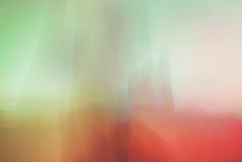
Join Stephanie Osmond and Trudie Moore for a joint exhibition of individual and combined works exploring light, abstraction and feeling.
More details to be announced soon, to receive updates, fill out the contact form below, subscribe to emails using the popup or send a message


Creative process, colour and Cornwall’s light. Uplifting and communicating through sensation and materiality.

Your work often explores the tension between control and freedom. Can you describe a moment in the studio when a painting has completely escaped your original intentions, and what that taught you about your own creative process?
I have different ways of starting paintings and often I work on more than one at once because it enables me to process and articulate several ideas at the same time. I can carry out those ideas on different canvases or forms without them all competing with one another and this means that each one of those paintings is then articulated for a different idea and a progressive iteration. They are sometime small nudges but also can be bigger ideas about shape, technique or materials and that means that different surfaces and forms become linked with a continuous theme even though they might appear visually quite different.
I feel that this speaks a lot of the human condition for people who have busy minds and a lot of ideas. There is a calmness that’s obtained by focusing on a few precise moments and channelling them into separate outcomes.
Whenever I have started a painting with a pre-determined plan and have tried to stick to it, the painting doesn’t work. There is an air of discomfort, and it becomes contrived. It works much better to have a general plan of the particular contrasts I want to set up and for the techniques that I am going to use and to then refine those and bring them into a satisfying aspect within the individual work.
Sometimes the idea doesn’t articulate itself in the same way that had been imagined in the mind’s eye because it seems to be an impossible task to guide the immaterial visual into material being. That means that the materials do a lot of ‘the talking’ for the painting as they then form this kind of outcome that had been unexpected, but which also is a product of the artist’s experience and skill with the materials. I do make sure that the paint application is a refined and finely tuned experience befitting of the quality of the end crafting. Where there are areas that the paint leaks or spreads in an uncontrolled way, this creates a difficult feeling for me, as messiness feels like something that is not wanted or expected and will be judged. But in the end, I learn to enjoy and embrace it for its character and the way in which it brings this conversation to life. Leaking a little is like a twist in the intention that isn’t within my control, but that’s an interesting moment.
As a result, I have made a habit of approaching the canvas with very much an open mind about what is going to happen. There are so many difficult decisions to make to ensure that this valuable material isn’t wasted and that the slightest wrong move doesn’t mean huge dissatisfaction or even repulsion at something feeling uncomfortable.
I can stand at the edge of the canvas with the colour decided, the paint mixed to a desirable colour and consistency and then the real moment of truth about the success of the painting is held in the single moment that I choose to make the first mark or pour. But then things relax and the smaller decisions lead the painting on, one at a time. It does feel a little like standing on the edge of a rock being about to jump into the sea but it’s like making the first move in anything in life, you start something and it feels like a huge gamble with an unknown outcome where you don’t know how it will go, and you have to then respond to what you are met with in the next brave manner. Fortunately for me, I have always worked on a large scale ever since I was a student and that means doing big paintings doesn’t scare me.
All images © Trudie Moore
You worked with Bridget Riley during workshops in the 1990s, and colour remains central to your practice. Looking back, what is the single most important lesson you carried forward from that experience, and how has your interpretation of colour evolved since then?
I was so fortunate in the 90s to have had such a huge artist icon Bridget Riley carry out some workshops on colour. I remember trying to colour match to samples of her paintings and how difficult it was to obtain the exact hue and shade of a colour and to match it. Something so simple is a masterclass of precision and refinement and really looking hard. It’s so easy to imagine a colour, think that you have got it and then to realise that the visual frequency that the imagined colour was is such a long way away from that.
A whole lifetime could be spent in achieving this sort of precision and it really teaches you to look, think and create slowly and to give an extreme level of depth to the decision. This has stayed with me in my practice and as a result, the method of staying visually simple and being exacting was a lesson in the essence of abstraction.
I used to work with a full colour range that included greys and browns and what I would say were richer, earthier and solid or bold colours, but as time has gone on the palette has lightened and narrowed into clear and clean colours that feel comfortable to me. But being comfortable with colour to me doesn’t mean being safe. The colours I use are often rebellious, risky and challenging and maybe a little anarchistic, whilst being also clean, pure and full of light. There is a purposefulness to the light and bright colours because they are uplifting to those who are open to them, but equally they scare and repel others, especially those who want to stay in a ‘safe zone’.


Cornwall is often associated with landscape painting, yet your work communicates through abstraction, light and material. How does living and working here influence your decisions without becoming the subject of your paintings?
Living in Cornwall and being surrounded by many landscape artists is a frank reminder of why I do what I do and why I enjoy it. It could be so easy to try to be someone else or to replicate the work of others to feel as though fitting in is the thing someone should be doing. Some of my very early paintings had elements of abstracting from the seen world in them but I felt more strongly excited by a purer abstraction that started in the 90s which was known as process painting – a variety of analogue treatments and experimental interventions superimposed upon the canvas. This innovative approach has informed my work as it opened my eyes to something that was completely new. What I really enjoy is creating challenging art that lives more on the edge of adventure. This is definitely a more difficult and independent path to follow that requires greater inner strength and conviction, I enjoy doing something that is different to others.
I spend a lot of time in nature and the wildness of the west coast with its elemental winds, risky seas and quieter places stops me from feeling confined and makes me feel more expansive. It’s impossible to keep these feelings out of the artworks as they are what creeps in to every part of life. The colour has evolved in line with these connections to nature and light and the purity of it. There have been some strong moments of what feels like channelling light into the paintings.
Materials-wise there is an aspect that links too and the synthetic paints are in strong contrast to the natural fibres of bare canvas. I like to touch and feel the sand, rocks, trees and feel purified by being in cold water. There are textures and shapes that Barbara Hepworth and the other famous artists of Penwith used in abstracted ways and I can feel the similarities and draw connections between the different elements of the landscape, those historic artists’ work and my work even though I’m not working in the same space that they were.

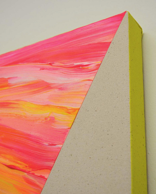

Your practice moves beyond canvas into acrylic constructions and installations that alter the viewer’s perception of space. What draws you towards these physical interventions, and how do you want people to feel when they encounter them in person?
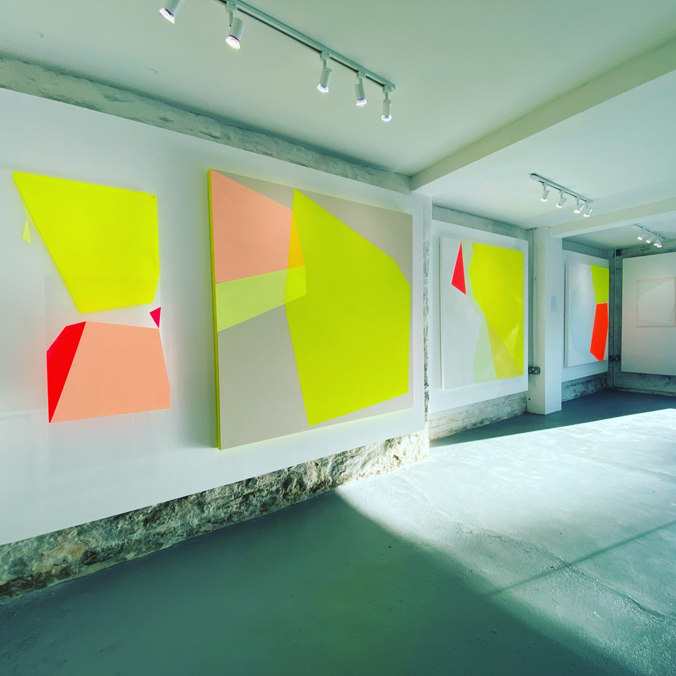
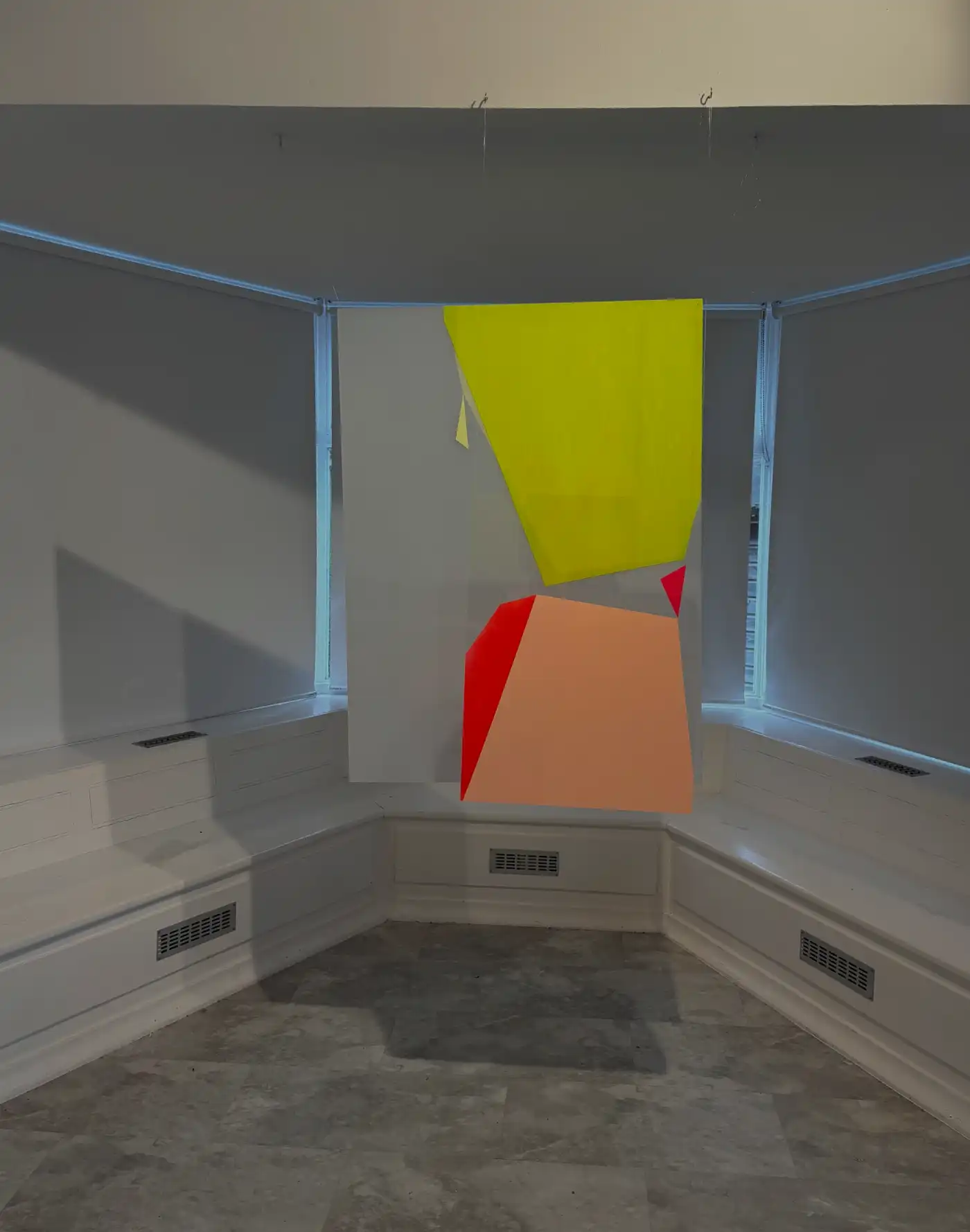
My acrylic constructions are an exercise into immersing people into more than one dimension, that of the two dimensional becoming three dimensions which then impact upon the fourth dimension (which l see as the glow of the paint coming into the room from the canvas) and then the fifth dimension, which I like to call the spiritual or emotional impact on their body and soul.
There is an experience of colour and an embodiment of it upon the person as they stand in the presence of it. For me personally the large yellow fields radiate warmth into my core and fill my eyes with a sort of stimulating dopamine hit that I don’t experience any other way. I have witnessed people physically change, straighten their posture and become more animated as they are hit by the impact of the paintings. They know they are drawn to walk over to them and just after they are stood in front of them the mental and physical uplift takes hold. It’s an exciting prospect to find something that can help people to feel good and create a sort of social impact, especially when times are so difficult to navigate.
My work is an exercise in communicating through experience and feeling and if that’s the main takeaway from what people see then that means I have succeeded.
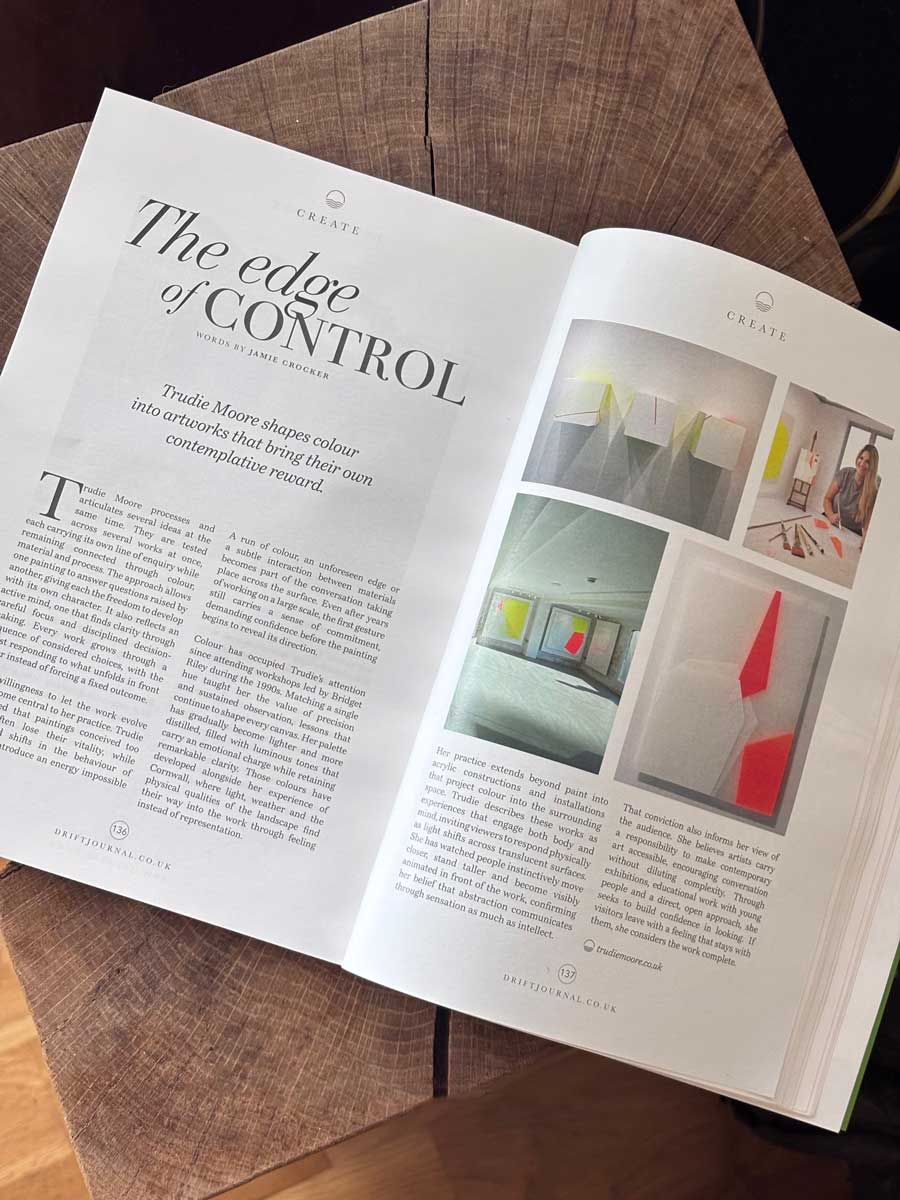
A long form interview that goes further into depth from The Edge of Control, a feature in Drift London. The questions in this article were supplied with thanks by Drift Journal.
The edge of control - Drift Journal
The edge of control - Drift August 2026
This summer I spoke to Drift Journal about my process and living and making art in Cornwall and how it inevitably takes a role in shaping how the works present themselves.
In this article we talk about the influences over a long period of time, what I’m looking for in terms of how I control the artwork, my considered choices and how I allow it to evolve.
“..Trudie describes these works as experiences that engage both body and mind, inviting viewers to respond physically as light shifts across translucent surfaces. She has watched people instinctively move closer, stand taller and become visibly animated in front of the work, confirming her belief that abstraction communicates through sensation as much as intellect…”
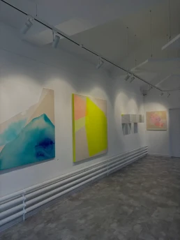
Artist in Residence at Truro High School for Girls
Artist Gallery Residency
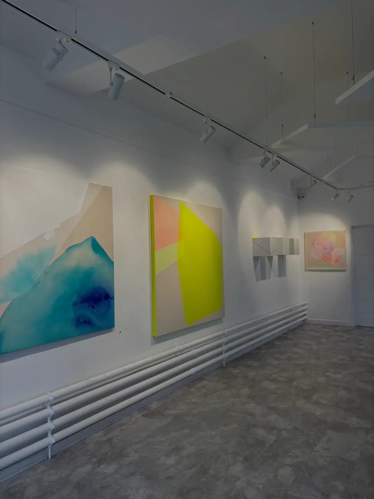
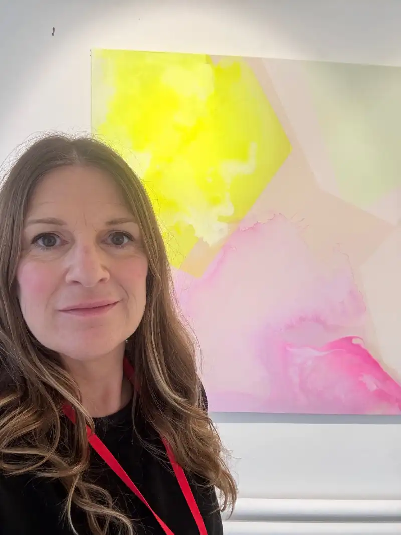
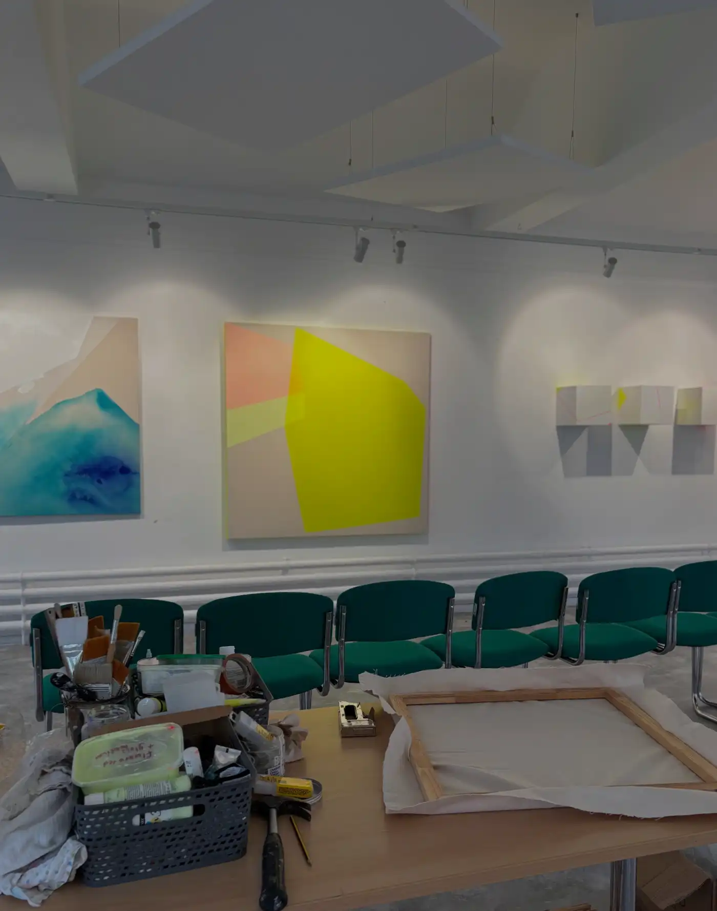
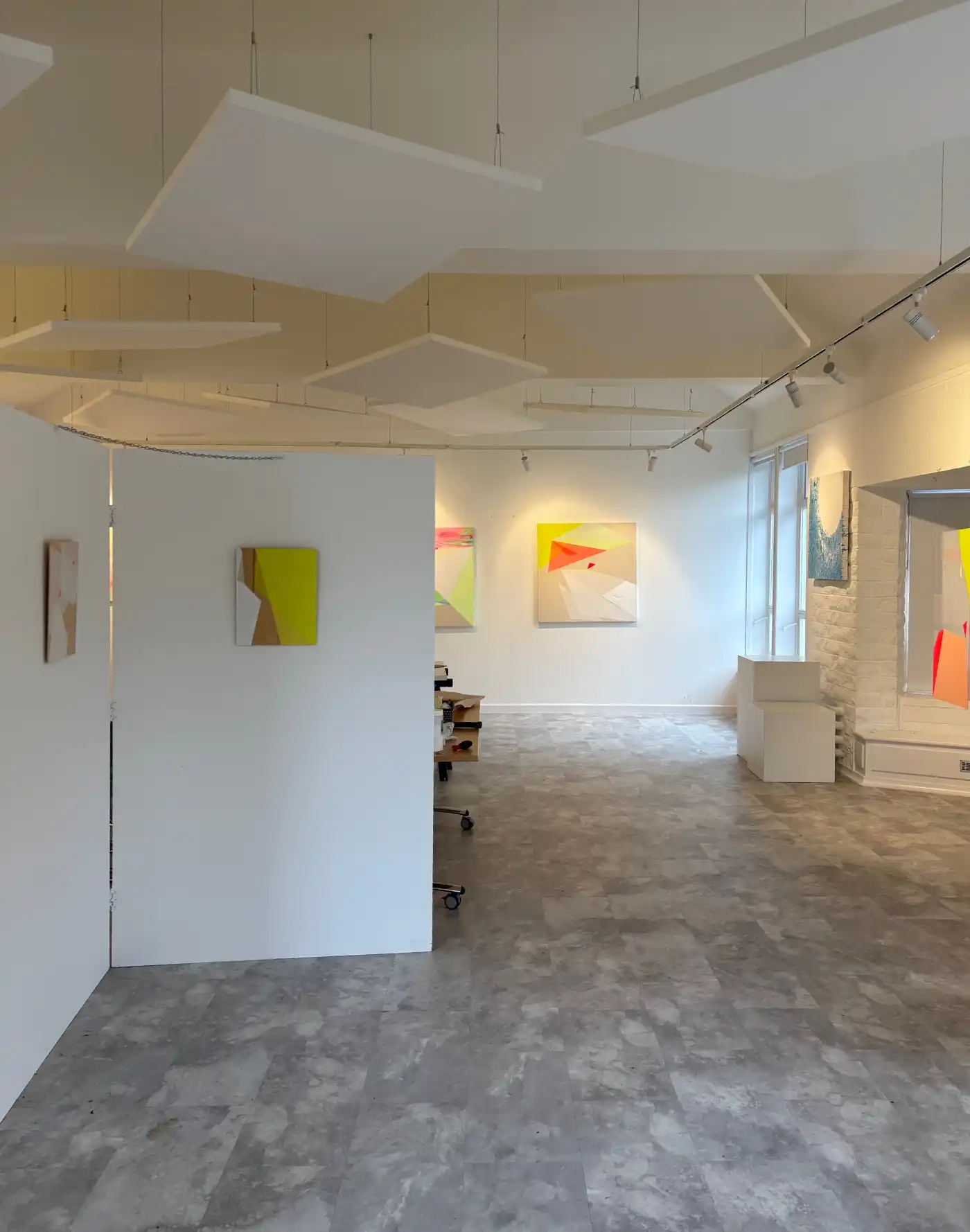
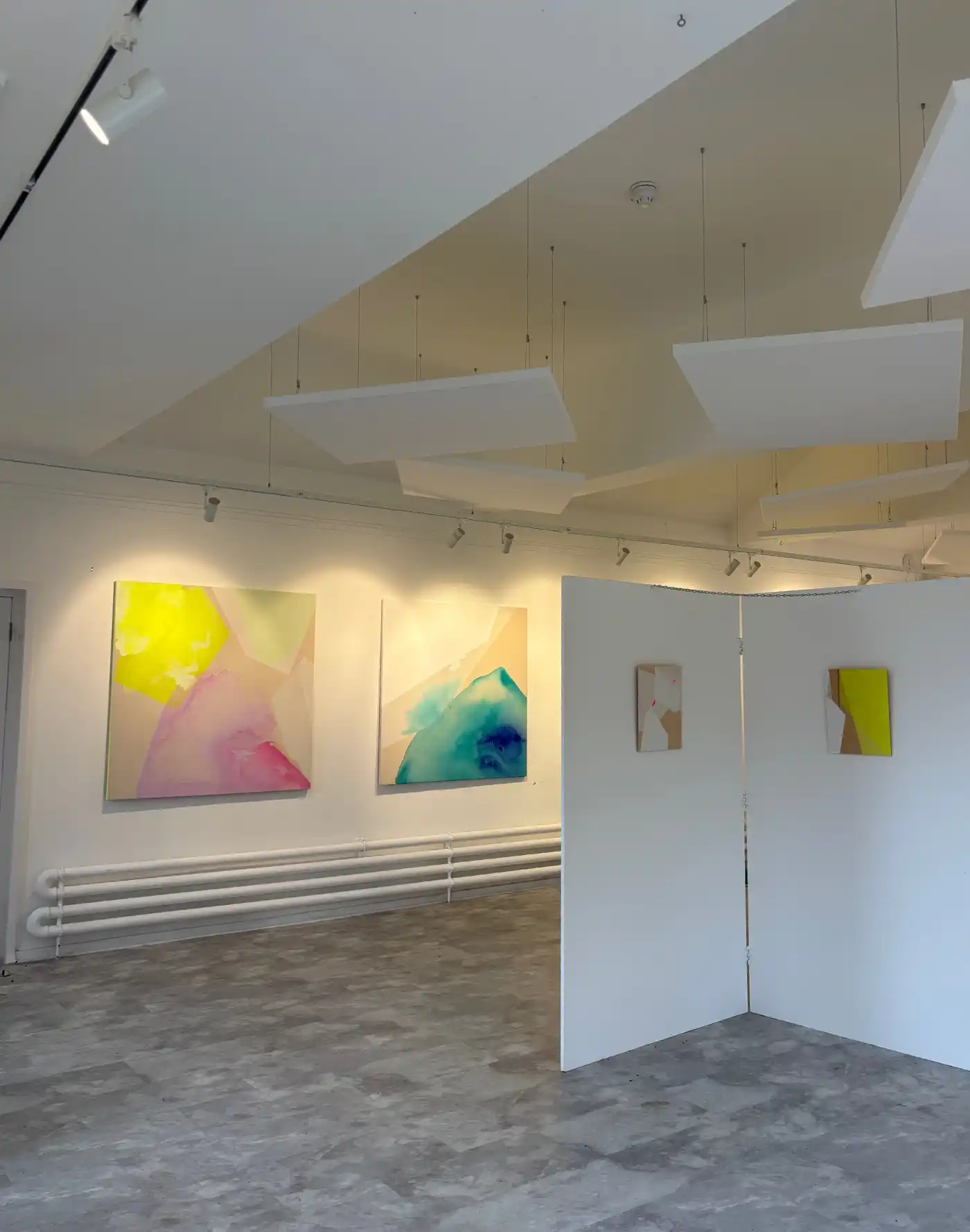
For the last fortnight I was delighted to take up residence in the gallery at Truro High School for Girls .
A lovely warm welcome was waiting for me over the last two weeks and it’s been a really varied experience to be in an educational setting and to take part in bringing abstraction and colour in contemporary art practice to these young people and seeing the different ways in which they can engage with it as a part of their academic syllabus.
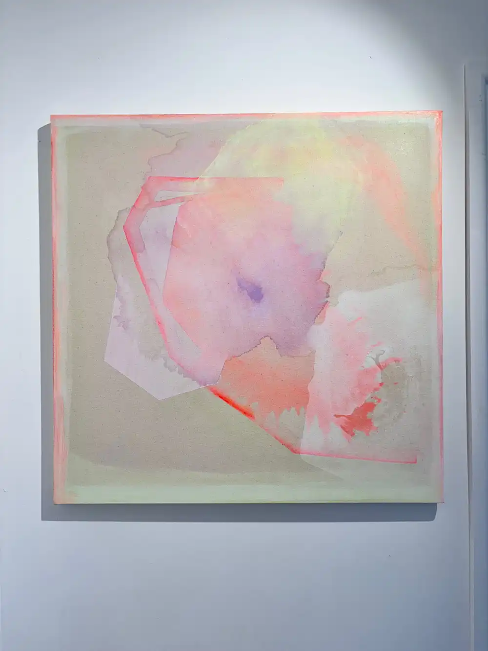
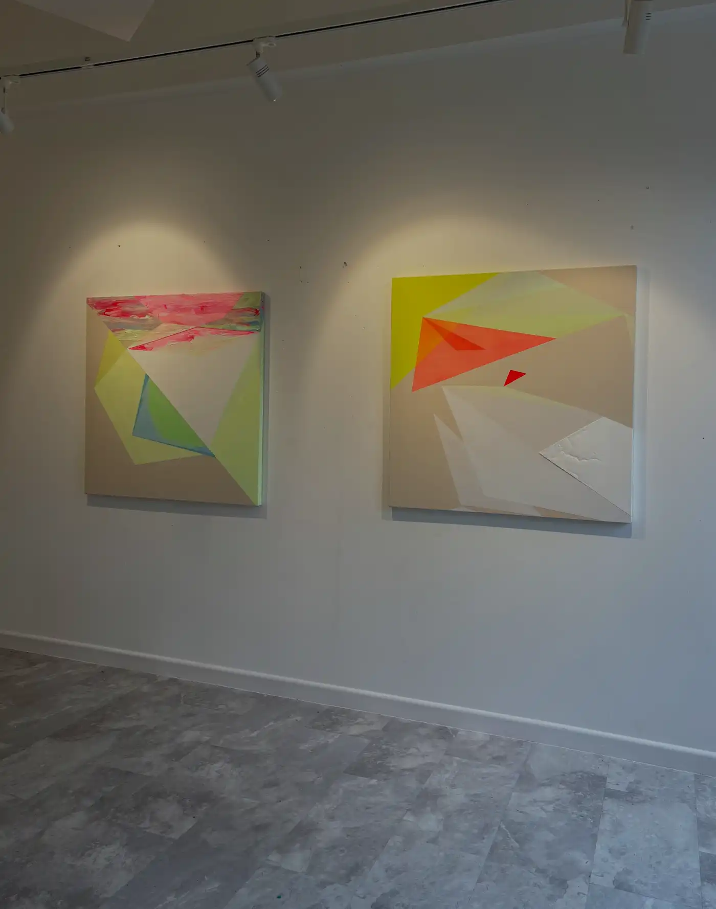
I took over a selection of recent works, pieces in 3D large scale works ad one or two older pieces to demonstrate how artwork practice can evolve and to show the different lines of enquiry that can emerge from an experimental approach to painting.
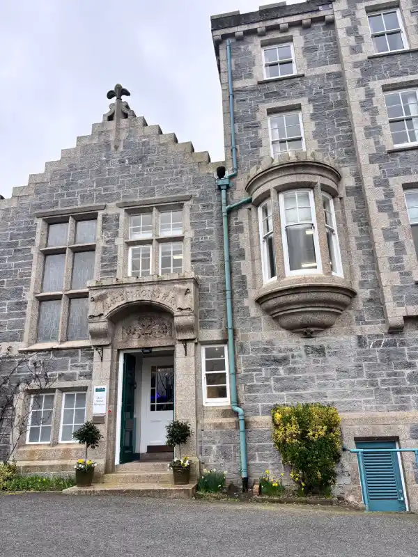
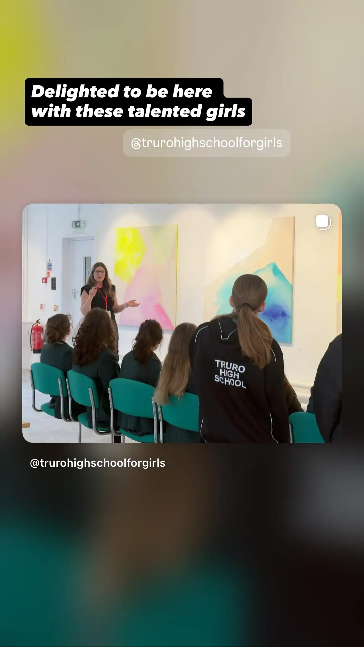
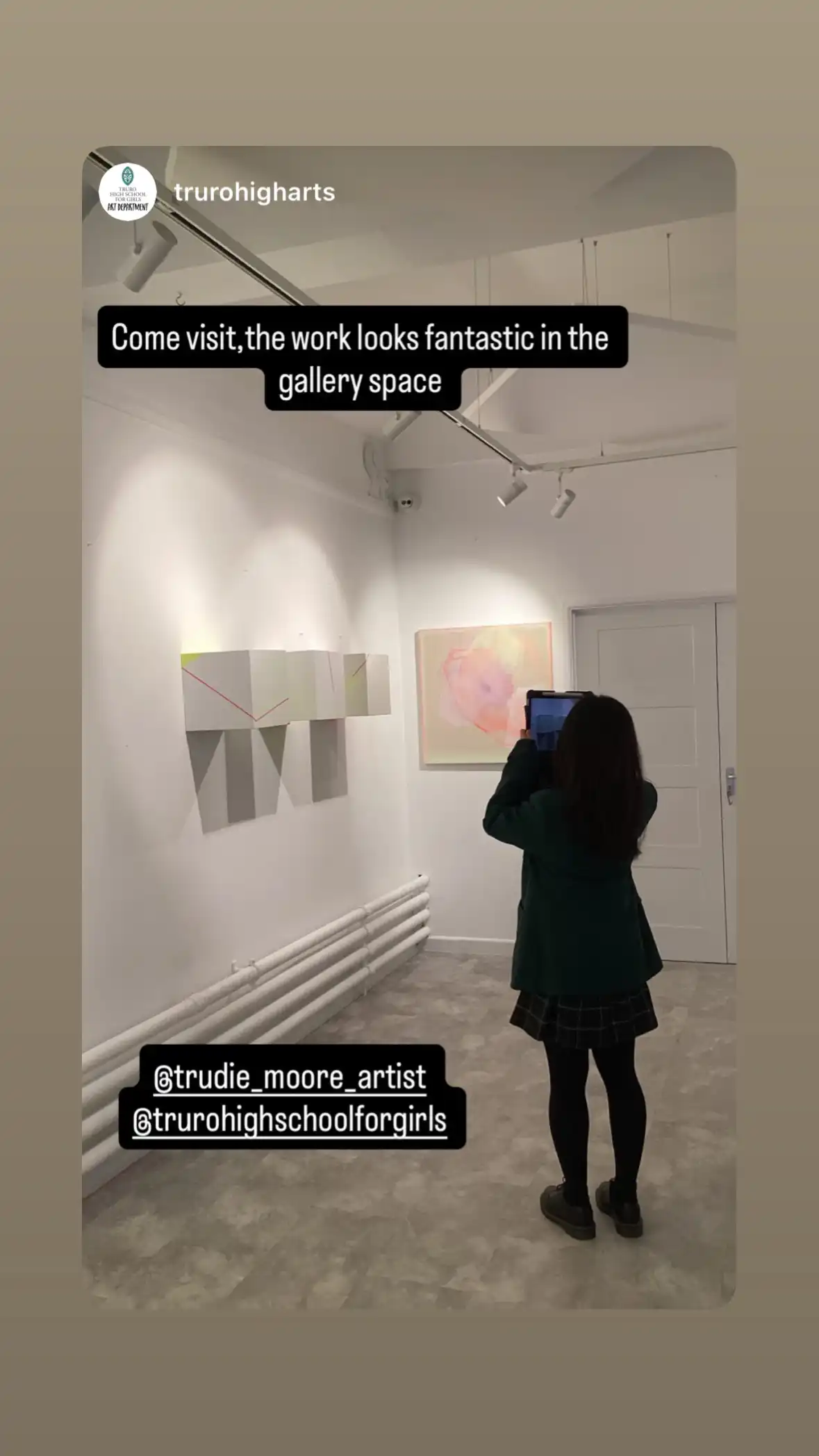
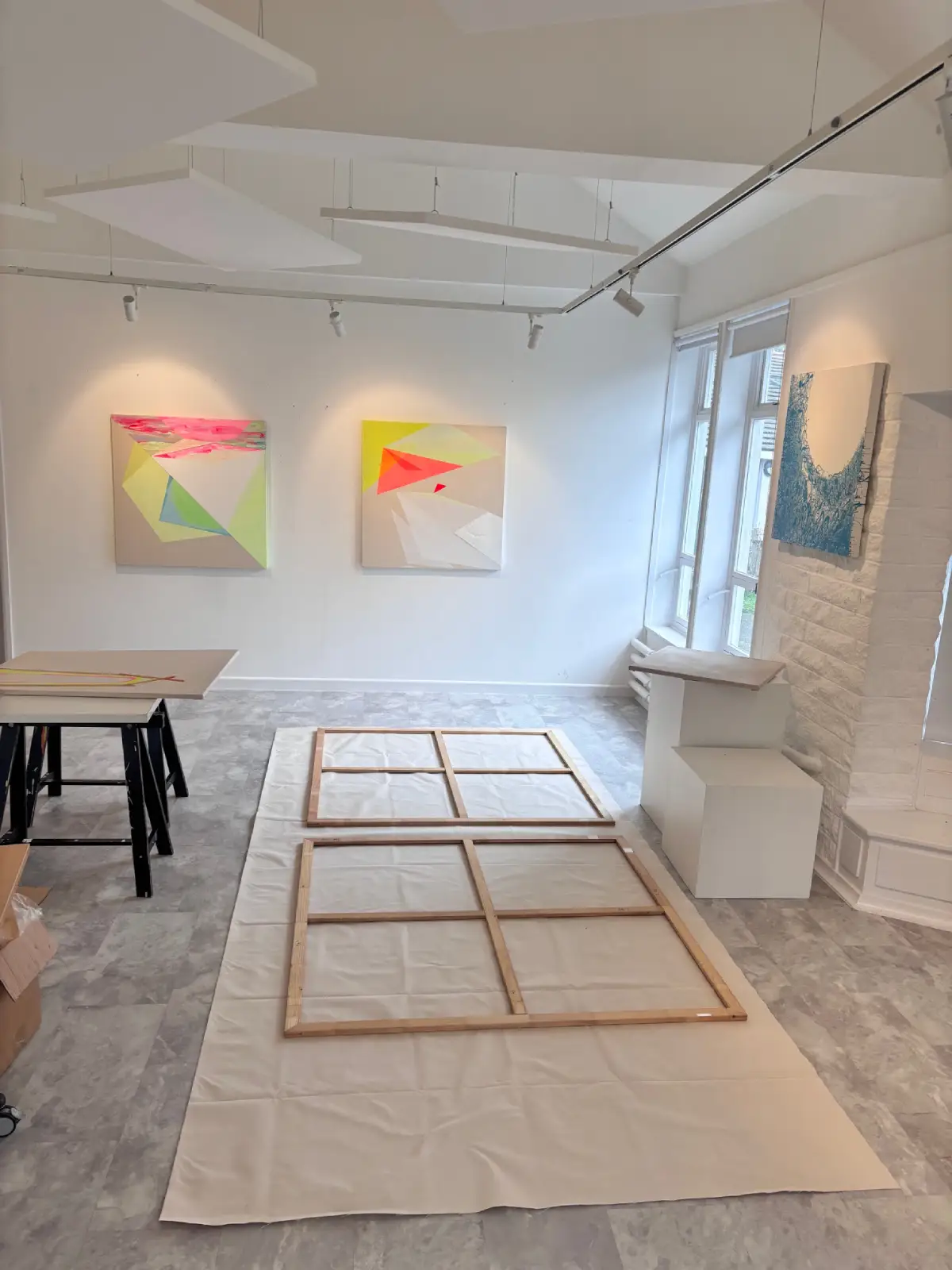
Truro High is really well equipped with a gallery to be able to run shows for the pupils and visiting artists and I had the freedom to start on new work whilst occupying the gallery which added depth and richness to the ways the pupils can see the work and understand the processes.
Different talking points around abstraction
Together with year 9 we discussed a range of influences and concepts that go into my work and where those fit culturally. We explored ways in which other current artists use similar themes to mine ad how that sits within the context of modern art history.
I demonstrated how colour can reflect or create an emotion, and also how punk culture has used disruptive colour.
Also we had a look at balancing colour palettes with bold and energetic colour by adding softer tones, described the process painting techniques that painters such as Ian Davenport and Jackson Pollock utilised and how those have informed the materiality of my works. We covered how being precise about colour like Bridget Riley can be really important and about how slow processes lead to carefully decided actions, and how taking risks helps to find success.
Creating new pieces in week one
Week one of the residency gave me the opportunity to break away from thinking about existing works that have been lingering and to move on and cover some new ground. I don’t think I would have otherwise carved out the space so this has been a great nudge to make a start! Here’s what I did:
- Started smaller pieces on canvas and perspex
- Stretched some big canvases
- Paint fluid forms built in layers with more delicate colour palettes
- A couple of other completely different perspex experiments
- Some planning for a future project
- Coordinated some pieces on site that were chosen in advance for the properties that I wanted to talk to the pupils about
It was clear by the end of week one that the change of location and the feel of the place has put me into a different mindset and has stimulated some altered visual results both in terms of colour and form and relaxing the geometrics to create some fluidity.
I have taken away some of my own sets of rules around what the paintings need to be like and have delved into being a little freer. The perspex panels are a layered (front to back) painting and have been sat around in the studio for a long time with a lack of decision around starting them. Painting them now, in synchronicity with the smaller canvas has become a 3D layered triptych that partners the canvas so that when hung the two paintings can accompany one another in telling the story of the materiality.
I also did some work to one of the large canvases which started with a glimmer of a thought prior to beginning, but in the end I dived in and responded to the outcomes of the initial application as it started to form.
.
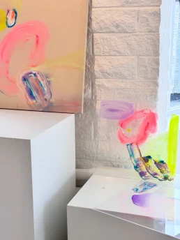
Talking about process, materials and switching the lights off!
With a smaller group of year 12 & 13 pupils we had a great time talking about the physical painting process, how a painting started, how I would make a start on the two large pieces I had just stretched and going from blank canvas to making the first ambitious and risky first move, but then moving past that to manipulating the materials and then allowing them to sit and find their place.
- We chatted about control of materials, and again, risking the painting while adding areas of colour and doing big pours and hoping for the best, but then appreciating the unplanned things that can happen and seeing where they take the painting. Then onto living with the artwork to see how it might develop and seeing how that can help with decision making as the piece progresses.
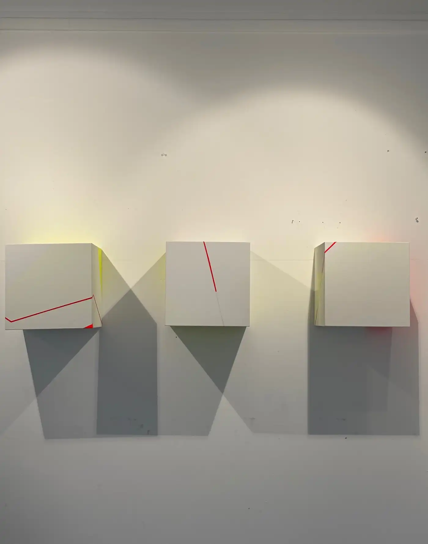
- We looked at the potential for different materials and different iterations of themes and how they would change a piece, such as canvas boxes being re-created in a transparent material and playing with the light to get the pieces to change and take on colour, shadow and then at how it adds dimensions that the viewer can see and feel.
- We demonstrated how multiple pieces can be considered as different strands of the same body of work, but seeing what different directions they go off in, and then viewing those variations that have happened over a period of time, whilst they look different, as being a cohesive collection (with a little side note on how this is very different in a fine art practice to being a commercial artist, where the same formula is repeated to create customer / viewer understanding and recognition). In this practice it’s about risk taking and developing ideas without rules in order to make discoveries that push the practice forwards.
When we looked at colour and the luminosity of the light on the paint we had a go at switching off the lights to see how the effect of changing the lighting might increase the charge of the colour in the dark ( as I was writing this and looking out of the window I spotted the sky switch to night mode, looked straight back at my phone and the notes app also did that!) also talking about the properties of phosphorescent paint and pigments and planning to create a ‘dark version’ of a piece that uses phosphorescent pigment to glow in low light and how using a range of the innovations in materials can help to change artwork.
We then moved on to finding out about their personal projects and seeing how this gives them an individual line of enquiry, and talking about how those themes fit into the diverse range of contemporary practice, artists and genres that could be used for helpful reference in developing those themes they are working with.
Finally, we also had a go at getting the girls to rate how they felt before and after the ‘colour bath’!! They returned back to the classroom and rated if they felt uplifted by the artworks.
Week 2 – progressing paintings and sparking an interest in abstraction
I was really chuffed to see lots of year 7 & 8 pupils in the gallery with watercolours doing studies on the artworks and finding parts of process, abstraction and composition that they found appealing that they could zone in on.
The works that I had started in week one progressed quite a long way with some huge bold moves on the two large canvases, one medium painting scrapped and some well considered progression on the perspex and smaller canvas. Sadly these had to be left to dry for some while as they are quite wet and so will take more attempts to complete in the studio, however I’ll photograph then and maybe will be able to bring them back to exhibit!
Thank you Truro High School for Girls for a truly memorable fortnight
It’s been a valuable time and if you have found this interesting and would like to come to a future exhibition please join my email list below or get in touch with me
Sign up to emails
If you would like to be invited to a private view, or receive notifications for exhibition, regular updates by email from the blog, then please sign up to my email list here
or follow on Instagram or my Facebook page

Pay Later with PayPal
PayPal Pay in 3 - Pay Later with PayPal on my website
Art can be a big investment! I've activated Pay Later on this website so that you can check out securely and purchase artworks by paying in three instalments.
To date I have offered flexibility via Bank transfer, 50/50 invoicing, cash or bank card on collection alongside using the PayPal payment gateway (which takes bank and credit cards), but now by offering Pay Later you can take short term 'finance' at 0% Interest.
Why I'm offering it:
- You get your painting straight away
- I get paid for the work in full upfront
- I get charged the standard PayPal fee
- the checkout process is secure and has a level of buyer and seller protection by PayPal
- it makes art easier to afford and to buy, which means I can ship nationally.
WHAT YOU NEED TO KNOW
- Pay in 3 is less regulated than other credit agreements so please read up on PayPal's website first
- You have to sign up to it
- you can monitor your payments via their app
- Initial payment made at the point of purchase with the following 2 payments made on the same date over the next 2 months from your debit card/bank account.
- 0% APR
- Use it on transactions between £30- £2000
You can find out more here: PAYPAL PAY IN 3
Please note: this feature is new to my website, so if you experience any issues with the website during purchase please let me know! Trudie@trudiemoore.co.uk


One Tree Planted and War Child donations
One Tree Planted - or more per sale!

My website is built on Wordpress and I'm joining in with their "WordPress Gives a Hand" charity movement campaign that's running from 25th-31st December 2023.
For my part, from 25th December 2023 to 31st January 2024 I'll donate a percentage of my online art sales to help One Tree Planted with reforestation.
We are in a climate catastrophe and are suffering a biodiversity apocalypse. The UK is one of the most nature-depleted countries in the world, we have lost over half our wildlife in my lifetime due to human activity and I want nature to be restored not just for the climate, but for all the species that depend on it.
Here's a map that tracks global forest loss to bring it all to life.
The amounts I'll donate are as follows:
- £1 on sales under £15
- 10% over £15 up to £200
- £25 above that
You'll be joining me in this venture as soon as you shop on my site!
 NO CHILD SHOULD BE PART OF WAR. EVER.
Warchild collections and donations from Open Studios
In December I was collecting for War Child during Krowji's Open Studios. I ran a small collection and promised to donate 10% of my sales for the weekend over the cost of the Open Studios fee (£35)
Sadly the donations given were less than £2, but I intend to carry this campaign on throughout the year by giving a fee the same as for One Tree Planted above. When you buy from me you can choose which of these two causes I donate to.
- £1 on sales under £15
- 10% over £15 up to £200
- £25 above that
War Child is the only specialist charity for children affected by conflict.
Around the world, children are facing unprecedented levels of conflict. This is especially true in Gaza and Israel, where thousands of children have died in the most recent escalation in violence, fighting and bombing. Terrified, traumatised and unsure of what the future holds, children living in Gaza, Ukraine and other conflict zones around the world are in desperate need of protection.
Find out more:
https://www.warchild.org.uk/
When you buy from me you can choose which of these two causes I donate to, please let me know in the notes field or by email!

Latest painting, May 2020 - Untitled

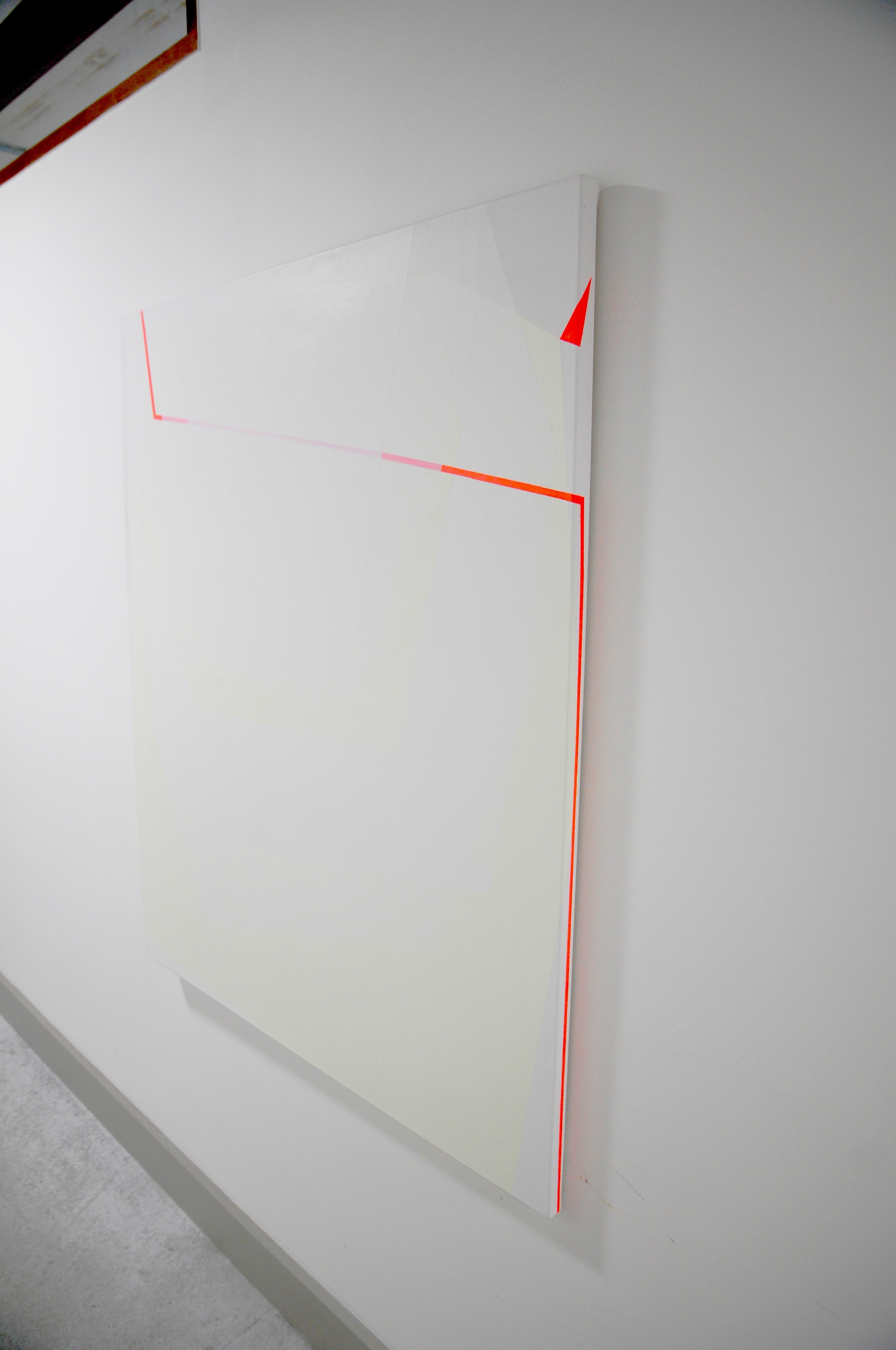
Untitled – [Red stripe with white and pale yellow pastel layers].
I have just completed this painting, it went on hold during lockdown and so the latest layers went on this week.
I have been trying to articulate how some of the transparencies I created on the ply box would translate onto canvas variations. The canvases I order are primed with a white primer, I don’t use rabbit skin glue because I refuse to be involved in animal cruelty as a consumer. So until I find an alternative, this gives me some limitations on how I use the paint when I translate it to canvas. There needs to be an addition of a colour to give the white transparencies something to show up against. The layers in this painting are extremely delicate and hard to photograph to show correctly and the studio lighting is overhead so that makes this task harder.
Hence I have chosen a pastel yellow made from combining fluorescent yellow and white. It’s become an essential part of the painting, not just a layer to form the underlying structure, but also a divider between two layers of ‘leaves’ of transparencies.
There is a rhythm througb the layers from canvas to the upper layers, a sequencing. The layers move outwards / forwards from the base canvas layer through pastel yellow, then white then yellow, they are intersected by the almost three dimensional red line (which itself wraps around the canvas and onto the sides) and the layering of white continues on top of this to seal it in.
If this were expanded out three dimensionally as panels they would be delicate, soft sheets. You could imagine walking through hanging layers or planes of space.
Around the edge to the top right there is a red triangle ‘tag’ device that would link this painting to the next, it’s a feature that has come from the previous studies on ply and the box where the elements of the paintings touch together.
All images © Trudie Moore

Current themes: transparencies, opacities, paint edges, material performance, three dimensional planes, lightness and freshness of colour, purity and expansion to create space.
Trudie Moore 2020
Transparencies and subtleties in my latest painting.
I’m in the process of developing a bigger, three dimensional body of work that expands planes and dimensions within my paintings. Materials are important to me, as much as colour and so I am investigating how the two work together to ensure the surface has an importance in the piece.
A piece I completed around Christmas starts to move into a much more three dimensional space. I enjoy working with materials that have a character of their own which brings a deeper concentration to the planes within the work. Ply has proved to be not just an appealing material with the natural wood grain contrasting with the plasticity and synthetic surface and colour of the paint, but it’s also a good, resistant and smooth surface that gives clean edges and sharp lines and a smoother surface to the paint.
So this has opened up for me various avenues I am exploring, how ideas translate both onto canvas and ply (and other potential materials) and how the elements within the paint itself work with the surface.
In terms of the paint application, there’s an ability with acrylic to create super sheer, delicate layers that can increase and increase in density and be built up to an almost plastic layer which sits elevated on the surface

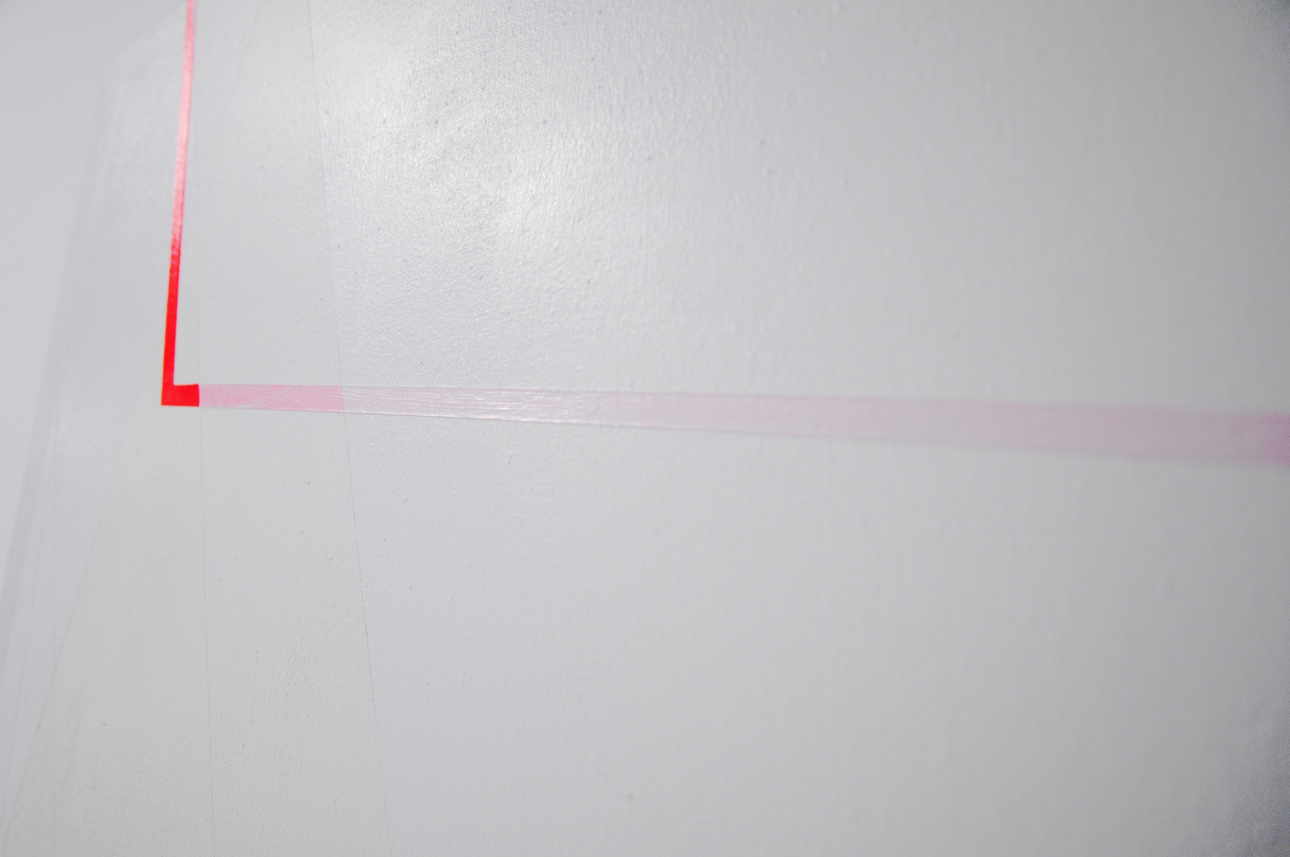


Untitled [Three dimensional box in ply] .
Amplifying the surface more extremely is an experiment I have been making. My deep frame canvases haven’t been deep enough to carry out the ideas I have been trying over the years and so this three dimensional box is the substantial iteration of that. From the smaller preceding ply studies there were planes of colour that were moving across. This is the next step on where the elements go around the sides and over the top – an element of wrapping the object as well as unfolding around it.
There is a stage on from this of exploring both ‘the material of the canvas’ and ‘the material of the paint’ as separate yet combined elements which constitute the painting.
All images © Trudie Moore


Supporting studies .
The studies below experiment with concepts in the pieces above, some are tests, some are works in their own right.


Alongside my fine art practice I undertake commissions and sell existing work. You can find out more here, or learn about the Artist Support Pledge.

POP TO THE SHOP!
Christmas baubles now on sale!
Discover my range of artist edition baubles now on sale in my shop!
To mark Christmas 2019 I’ve launched a range of individually painted artist edition baubles. There are 50 individual hand painted baubles numbered and initialled from 1-50.
Here’s a sample of some of them


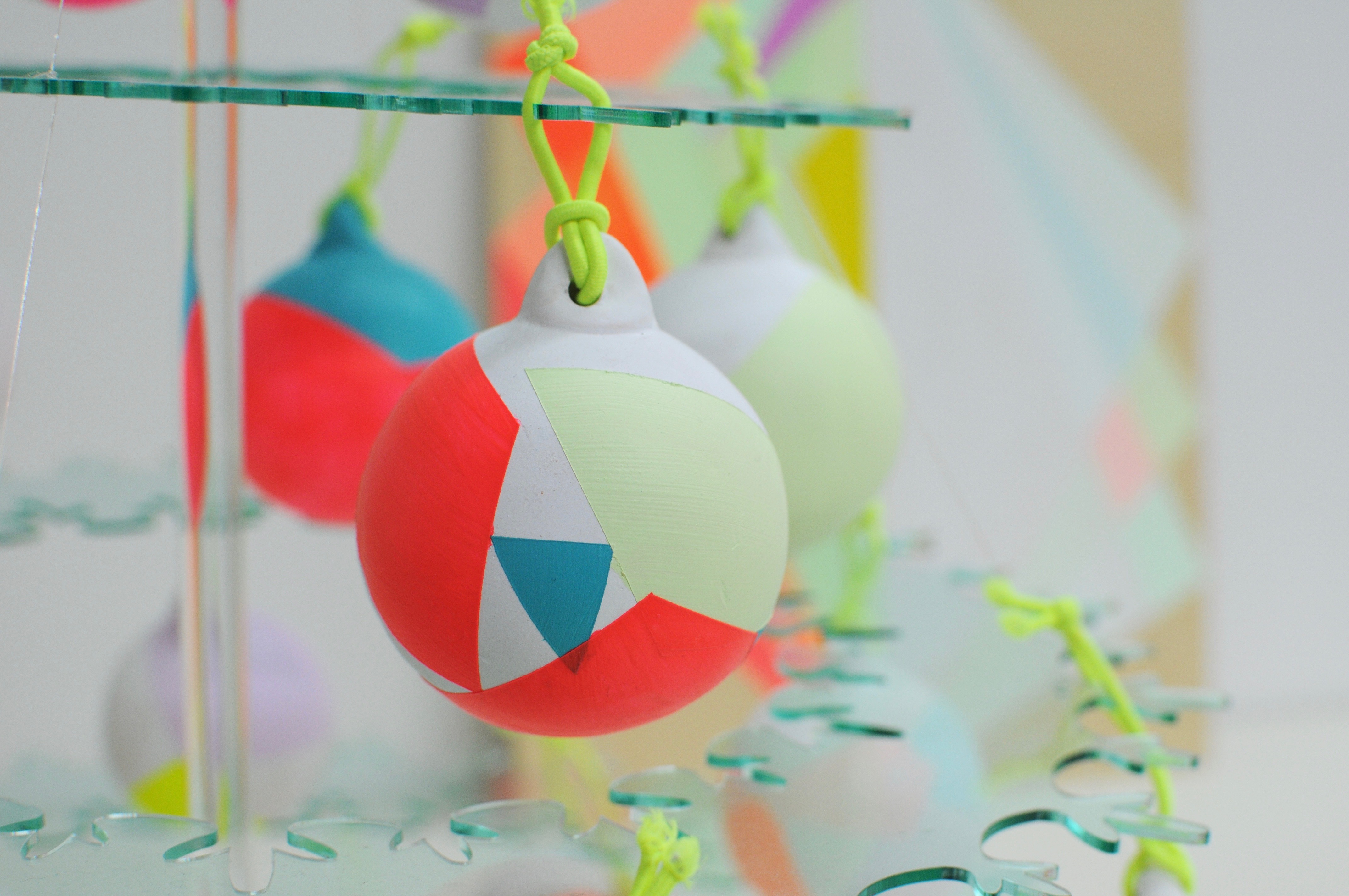


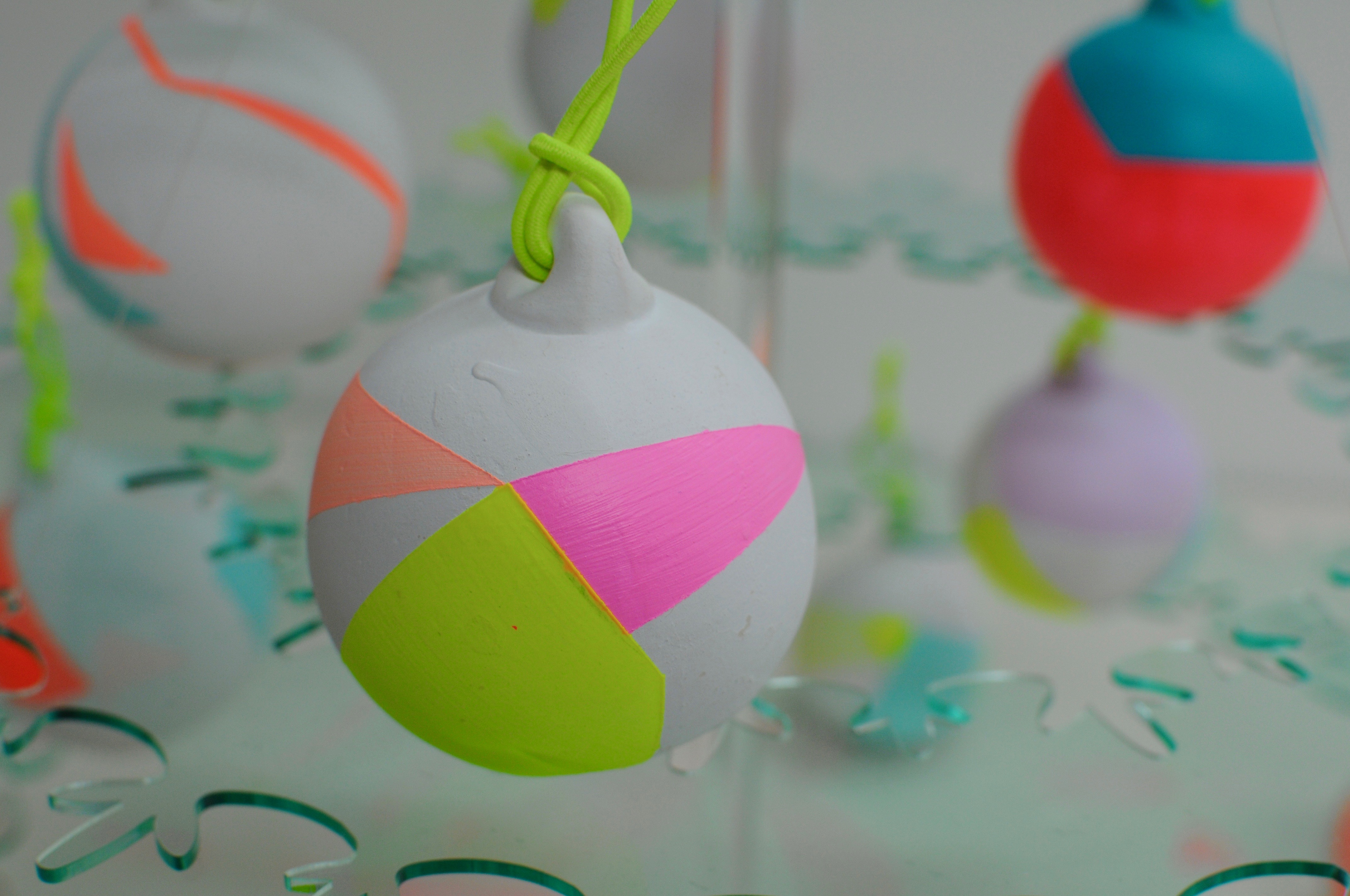
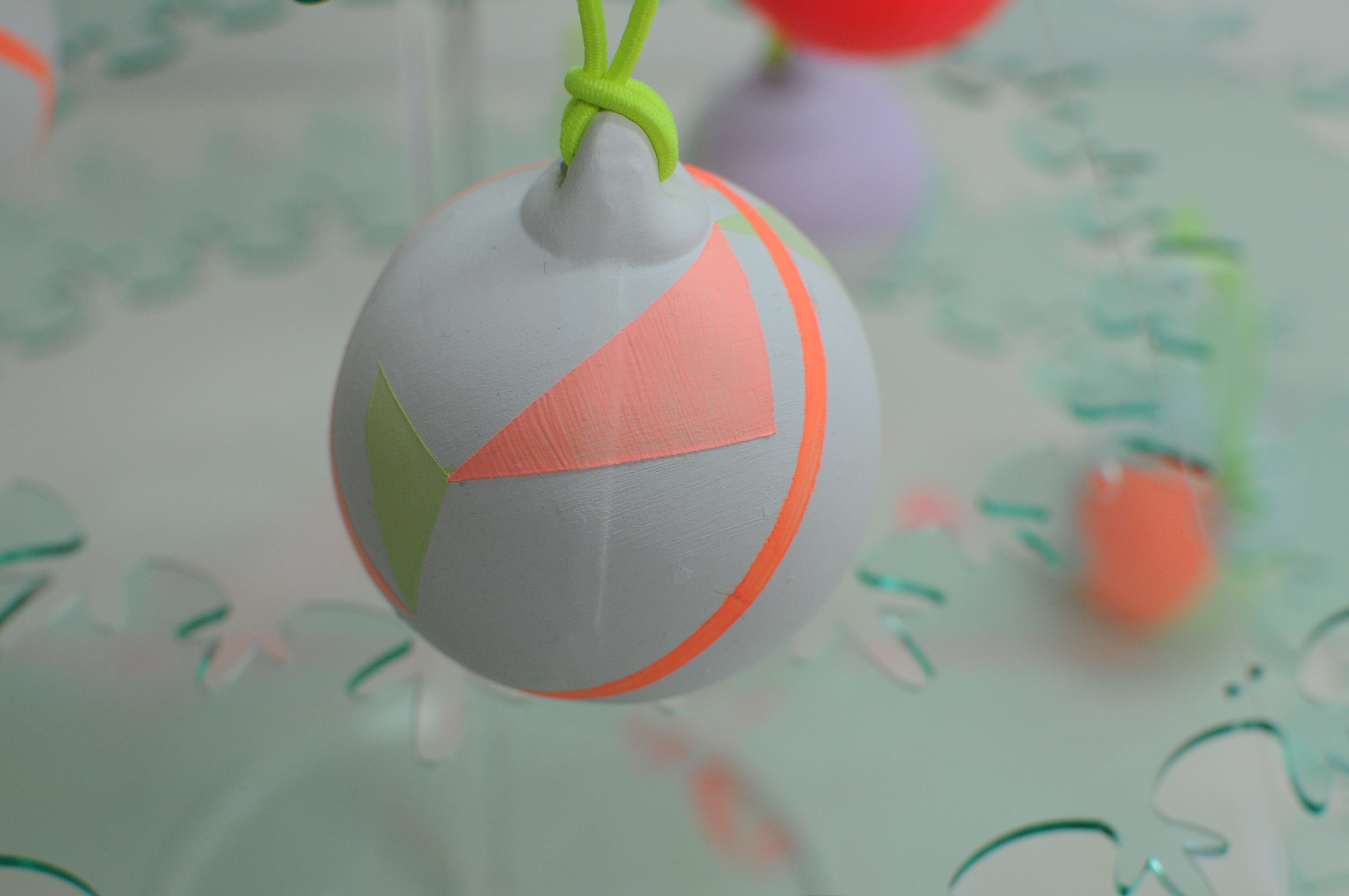


Brighten things up this year and add a little pop of colour to your Christmas tree with a unique piece of art. Create a neon and pastel theme or add a hint of bright, white and fresh colour and make your tree a colourful and contemporary work of art.
The first batch is now online! Each one is ceramic painted with artists acrylic paint in a range of fluorescent and pastel tones, transparencies and opaque panels to mirror my latest works.
The Christmas baubles are tied with neon yellow elastic cord and packaged in a white gift box.
Delivered in time to give as a Christmas present or to decorate your own Christmas tree.
POP TO THE SHOP!

Hello world and welcome!
Welcome to my super cool new website!
It’s been years in the dreaming, weeks in the building and eventually I bit the bullet to get on with a new site to showcase my paintings and my new start in Cornwall, view on mobile, buy more easily online and see all of my key information in one place.
I’ve had a custom website built by Sallie-Ann at Hype Digital for probably 15 years and she’s been, and continues to be, a great web developer to look after my website needs.
Sallie’s capable of looking after all of your website hosting, set up, e-commerce and web design whether you use Wordpress with a template and are a savvy user or a complete website phobe, or if you need bespoke coding and database needs. (Just a little plug here as I have been with her for a long time and she’s been awesome, responsive and accommodating and I know people go to her because of her skill and friendliness).
I started a blog on the side of the website for my art interests at Blogspot (which I have kept live for now as I won’t be importing all of the posts are at the moment) and so this site means I can chat art and link al my inspirations through into my website so that you can see how what I see inspires me to practise the contemporary abstract painting style that satisfies me.
If I go to an exhibition, gallery or view then this will be written about here alongside with showing you my latest practice, new paintings, working process and the critical theory that goes into my paintings.
So for the first post, welcome and I hope you fin the site easy to look around, please let me know if you have any feedback on it that I can accommodate to improve it!
And while you’re here, why not take a look at my portfolio!
Trudie


Barbara Hepworth Studio
A rainy day in St Ives.
I once visited the Barbara Hepworth Museum and Sculpture Garden in St Ives with my Mum but it was such a distant memory that now we are living in Cornwall and I have a local’s pass for Tate St Ives that this would be a great little hangout with a toddler in tow – if we could get there walking …
So after a trip around the gallery this summer, we walked over the cobbled streets and took a look around.
Finding Trewyn Studio was a sort of magic.. here was a studio, a yard and garden where I could work in open air and space.
Barbara Hepworth
Trewyn Studios.
Once you’ve gone through the museum you can go straight into the garden (safest bet with a small live wire). It’s not immense but it is well packed with hardy tropical plants which thrive well in the humid conditions in Cornwall, and Barbara’s substantial sculptures. Clearly the sculptural nature of the plants sits well with the sculptures themselves.
Now please bear in mind that with a toddler in tow I’m not stopping to have the opportunity to read the blurb and critically assess each piece (and it’s raining), I’m casting a swift impression and grabbing a few moments to take some photos as it’s really photogenic!


Sculpture Garden and studio.
The garden is a lush green space with a rooftop view and the studio placed towards the top by the house. There’s a simple loop around the garden with planting that creates vistas to enjoy the sculptures which make for a good photo composition. The bronze and stone pieces fit so naturally within this setting.
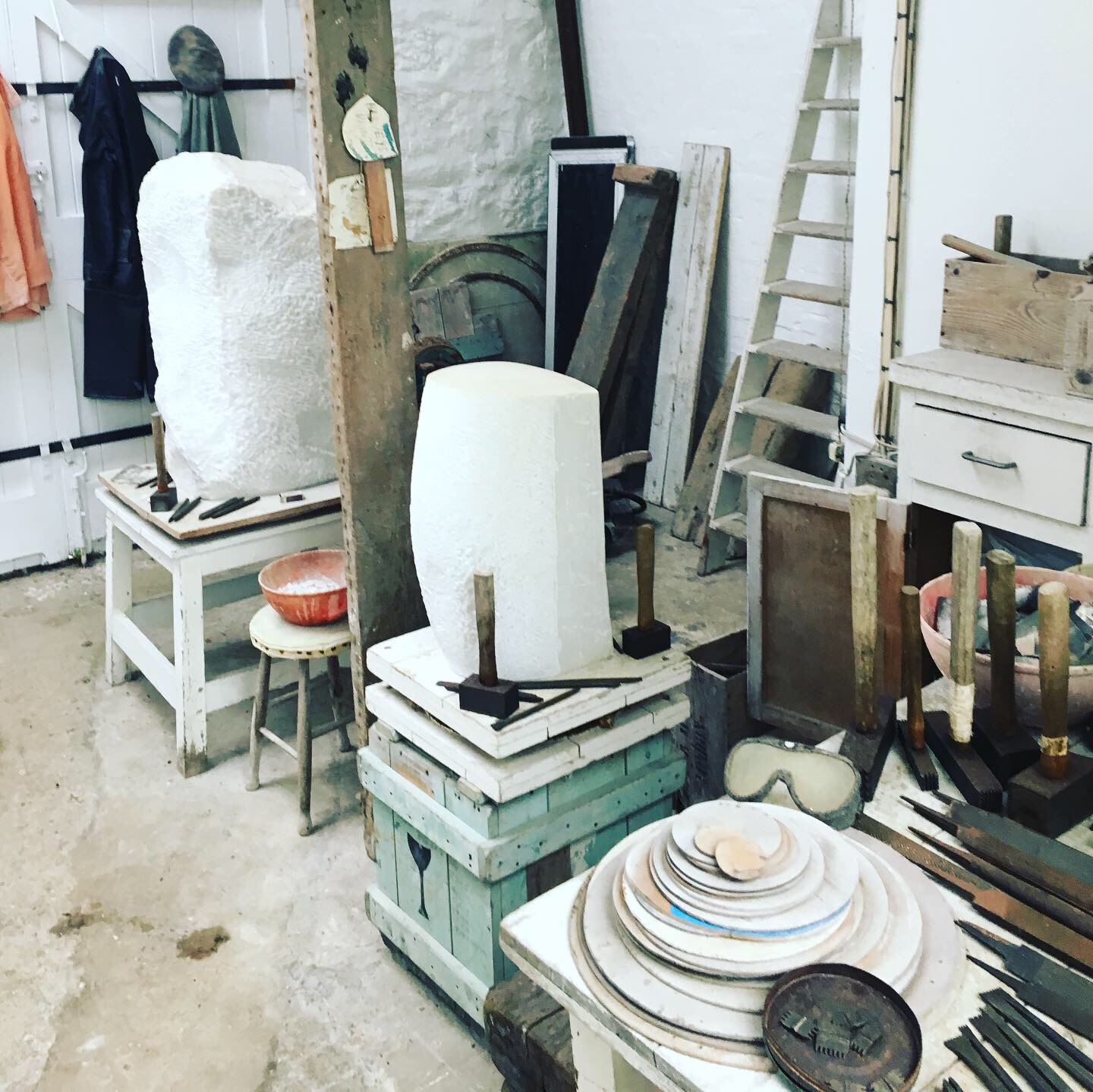
If you peer into the studio, you can see a large white piece and all Barbara’s tools laid out. This isn’t how they would have been placed while she was working, it’s definitely been lined up to look good as a museum piece to viewers as the placement is far too composed to be a realistic work station, but what is clear is that this was a large space in which to accomplish grand plans.
And grand plans take some money, which Barbara must have amassed some of over her career, I can’t imagine someone without great sales success (or being bankrolled) could have dreamed of getting a 3m or so high bronze sculpture (Four Square, 1966) cast and craned into position anywhere, let alone their garden.
So with the rain now parting we escaped back home – I feel lucky to have this so nearby even though it’s an exhibit that won’t change much over time.