


Creative process, colour and Cornwall’s light. Uplifting and communicating through sensation and materiality.

Your work often explores the tension between control and freedom. Can you describe a moment in the studio when a painting has completely escaped your original intentions, and what that taught you about your own creative process?
I have different ways of starting paintings and often I work on more than one at once because it enables me to process and articulate several ideas at the same time. I can carry out those ideas on different canvases or forms without them all competing with one another and this means that each one of those paintings is then articulated for a different idea and a progressive iteration. They are sometime small nudges but also can be bigger ideas about shape, technique or materials and that means that different surfaces and forms become linked with a continuous theme even though they might appear visually quite different.
I feel that this speaks a lot of the human condition for people who have busy minds and a lot of ideas. There is a calmness that’s obtained by focusing on a few precise moments and channelling them into separate outcomes.
Whenever I have started a painting with a pre-determined plan and have tried to stick to it, the painting doesn’t work. There is an air of discomfort, and it becomes contrived. It works much better to have a general plan of the particular contrasts I want to set up and for the techniques that I am going to use and to then refine those and bring them into a satisfying aspect within the individual work.
Sometimes the idea doesn’t articulate itself in the same way that had been imagined in the mind’s eye because it seems to be an impossible task to guide the immaterial visual into material being. That means that the materials do a lot of ‘the talking’ for the painting as they then form this kind of outcome that had been unexpected, but which also is a product of the artist’s experience and skill with the materials. I do make sure that the paint application is a refined and finely tuned experience befitting of the quality of the end crafting. Where there are areas that the paint leaks or spreads in an uncontrolled way, this creates a difficult feeling for me, as messiness feels like something that is not wanted or expected and will be judged. But in the end, I learn to enjoy and embrace it for its character and the way in which it brings this conversation to life. Leaking a little is like a twist in the intention that isn’t within my control, but that’s an interesting moment.
As a result, I have made a habit of approaching the canvas with very much an open mind about what is going to happen. There are so many difficult decisions to make to ensure that this valuable material isn’t wasted and that the slightest wrong move doesn’t mean huge dissatisfaction or even repulsion at something feeling uncomfortable.
I can stand at the edge of the canvas with the colour decided, the paint mixed to a desirable colour and consistency and then the real moment of truth about the success of the painting is held in the single moment that I choose to make the first mark or pour. But then things relax and the smaller decisions lead the painting on, one at a time. It does feel a little like standing on the edge of a rock being about to jump into the sea but it’s like making the first move in anything in life, you start something and it feels like a huge gamble with an unknown outcome where you don’t know how it will go, and you have to then respond to what you are met with in the next brave manner. Fortunately for me, I have always worked on a large scale ever since I was a student and that means doing big paintings doesn’t scare me.
All images © Trudie Moore

You worked with Bridget Riley during workshops in the 1990s, and colour remains central to your practice. Looking back, what is the single most important lesson you carried forward from that experience, and how has your interpretation of colour evolved since then?
I was so fortunate in the 90s to have had such a huge artist icon Bridget Riley carry out some workshops on colour. I remember trying to colour match to samples of her paintings and how difficult it was to obtain the exact hue and shade of a colour and to match it. Something so simple is a masterclass of precision and refinement and really looking hard. It’s so easy to imagine a colour, think that you have got it and then to realise that the visual frequency that the imagined colour was is such a long way away from that.
A whole lifetime could be spent in achieving this sort of precision and it really teaches you to look, think and create slowly and to give an extreme level of depth to the decision. This has stayed with me in my practice and as a result, the method of staying visually simple and being exacting was a lesson in the essence of abstraction.
I used to work with a full colour range that included greys and browns and what I would say were richer, earthier and solid or bold colours, but as time has gone on the palette has lightened and narrowed into clear and clean colours that feel comfortable to me. But being comfortable with colour to me doesn’t mean being safe. The colours I use are often rebellious, risky and challenging and maybe a little anarchistic, whilst being also clean, pure and full of light. There is a purposefulness to the light and bright colours because they are uplifting to those who are open to them, but equally they scare and repel others, especially those who want to stay in a ‘safe zone’.


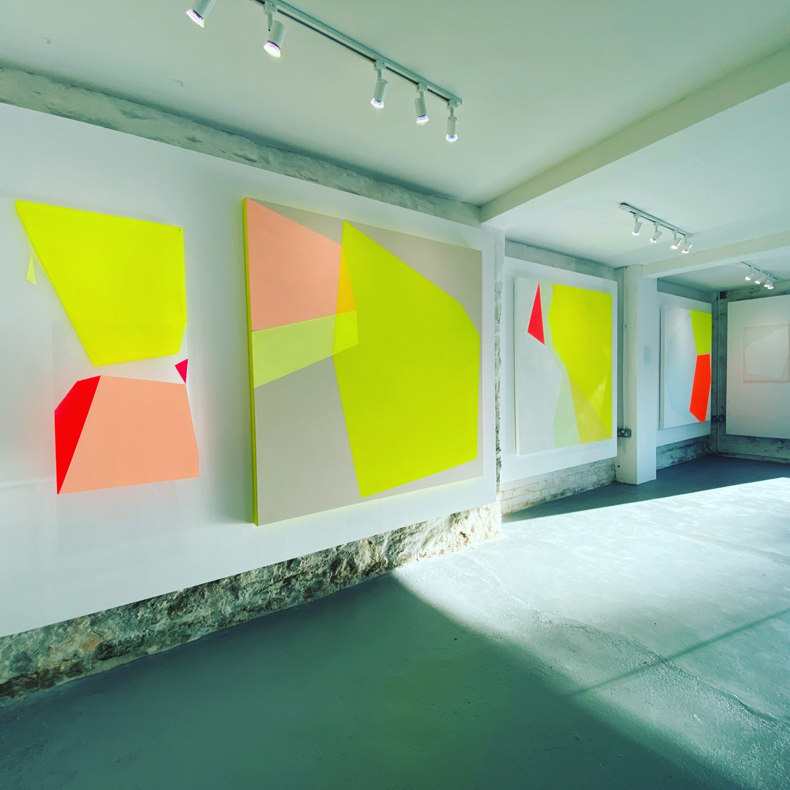
Cornwall is often associated with landscape painting, yet your work communicates through abstraction, light and material. How does living and working here influence your decisions without becoming the subject of your paintings?
Living in Cornwall and being surrounded by many landscape artists is a frank reminder of why I do what I do and why I enjoy it. It could be so easy to try to be someone else or to replicate the work of others to feel as though fitting in is the thing someone should be doing. Some of my very early paintings had elements of abstracting from the seen world in them but I felt more strongly excited by a purer abstraction that started in the 90s which was known as process painting – a variety of analogue treatments and experimental interventions superimposed upon the canvas. This innovative approach has informed my work as it opened my eyes to something that was completely new. What I really enjoy is creating challenging art that lives more on the edge of adventure. This is definitely a more difficult and independent path to follow that requires greater inner strength and conviction, I enjoy doing something that is different to others.
I spend a lot of time in nature and the wildness of the west coast with its elemental winds, risky seas and quieter places stops me from feeling confined and makes me feel more expansive. It’s impossible to keep these feelings out of the artworks as they are what creeps in to every part of life. The colour has evolved in line with these connections to nature and light and the purity of it. There have been some strong moments of what feels like channelling light into the paintings.
Materials-wise there is an aspect that links too and the synthetic paints are in strong contrast to the natural fibres of bare canvas. I like to touch and feel the sand, rocks, trees and feel purified by being in cold water. There are textures and shapes that Barbara Hepworth and the other famous artists of Penwith used in abstracted ways and I can feel the similarities and draw connections between the different elements of the landscape, those historic artists’ work and my work even though I’m not working in the same space that they were.

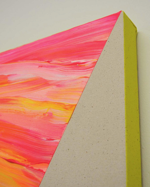

Your practice moves beyond canvas into acrylic constructions and installations that alter the viewer’s perception of space. What draws you towards these physical interventions, and how do you want people to feel when they encounter them in person?
My acrylic constructions are an exercise into immersing people into more than one dimension, that of the two dimensional becoming three dimensions which then impact upon the fourth dimension (which l see as the glow of the paint coming into the room from the canvas) and then the fifth dimension, which I like to call the spiritual or emotional impact on their body and soul.
There is an experience of colour and an embodiment of it upon the person as they stand in the presence of it. For me personally the large yellow fields radiate warmth into my core and fill my eyes with a sort of stimulating dopamine hit that I don’t experience any other way. I have witnessed people physically change, straighten their posture and become more animated as they are hit by the impact of the paintings. They know they are drawn to walk over to them and just after they are stood in front of them the mental and physical uplift takes hold. It’s an exciting prospect to find something that can help people to feel good and create a sort of social impact, especially when times are so difficult to navigate.
My work is an exercise in communicating through experience and feeling and if that’s the main takeaway from what people see then that means I have succeeded.
A long form interview that goes further into depth from The Edge of Control, a feature in Drift London. The questions in this article were supplied with thanks by Drift Journal.

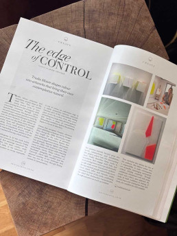
The edge of control - Drift Journal
The edge of control - Drift August 2026
This summer I spoke to Drift Journal about my process and living and making art in Cornwall and how it inevitably takes a role in shaping how the works present themselves.
In this article we talk about the influences over a long period of time, what I’m looking for in terms of how I control the artwork, my considered choices and how I allow it to evolve.
“..Trudie describes these works as experiences that engage both body and mind, inviting viewers to respond physically as light shifts across translucent surfaces. She has watched people instinctively move closer, stand taller and become visibly animated in front of the work, confirming her belief that abstraction communicates through sensation as much as intellect…”
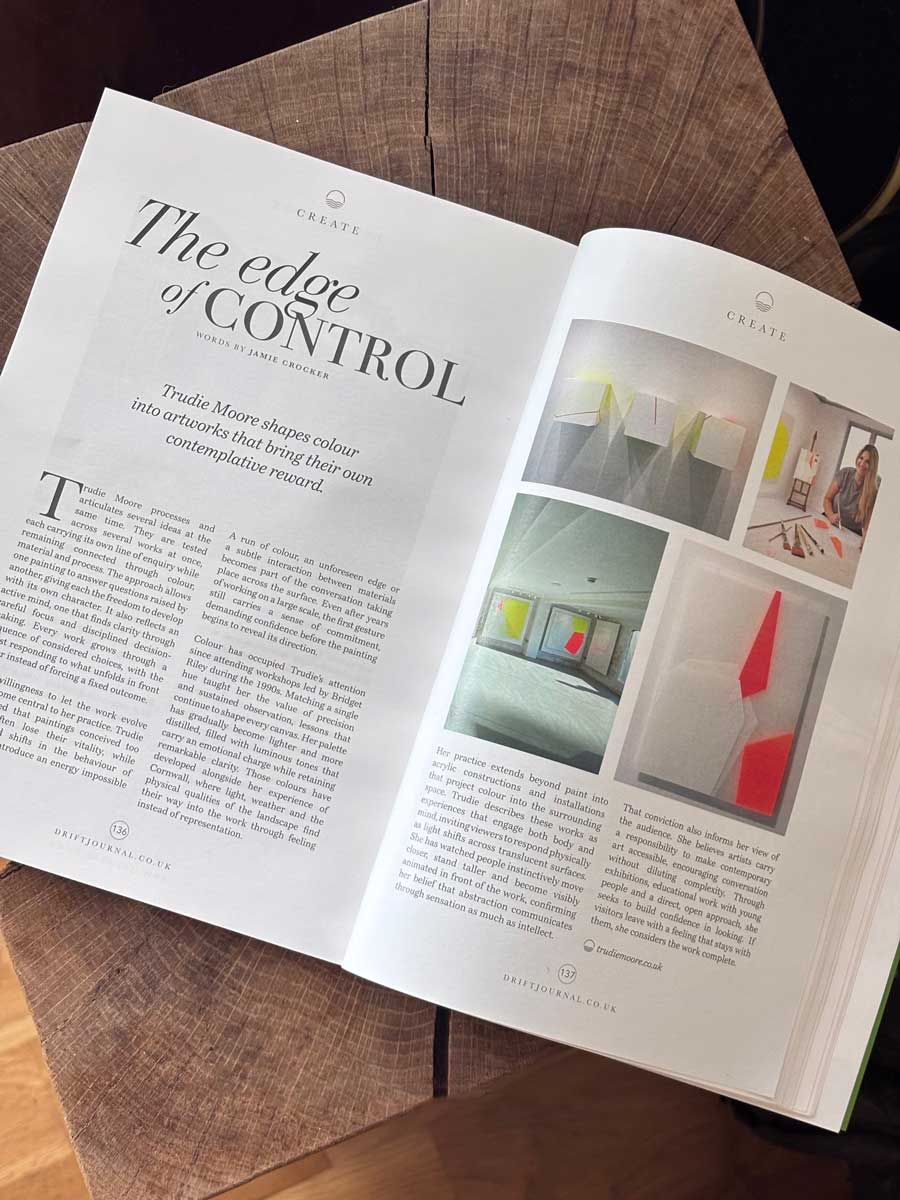

Latest painting, May 2020 - Untitled

Untitled – [Red stripe with white and pale yellow pastel layers].
I have just completed this painting, it went on hold during lockdown and so the latest layers went on this week.
I have been trying to articulate how some of the transparencies I created on the ply box would translate onto canvas variations. The canvases I order are primed with a white primer, I don’t use rabbit skin glue because I refuse to be involved in animal cruelty as a consumer. So until I find an alternative, this gives me some limitations on how I use the paint when I translate it to canvas. There needs to be an addition of a colour to give the white transparencies something to show up against. The layers in this painting are extremely delicate and hard to photograph to show correctly and the studio lighting is overhead so that makes this task harder.
Hence I have chosen a pastel yellow made from combining fluorescent yellow and white. It’s become an essential part of the painting, not just a layer to form the underlying structure, but also a divider between two layers of ‘leaves’ of transparencies.
There is a rhythm througb the layers from canvas to the upper layers, a sequencing. The layers move outwards / forwards from the base canvas layer through pastel yellow, then white then yellow, they are intersected by the almost three dimensional red line (which itself wraps around the canvas and onto the sides) and the layering of white continues on top of this to seal it in.
If this were expanded out three dimensionally as panels they would be delicate, soft sheets. You could imagine walking through hanging layers or planes of space.
Around the edge to the top right there is a red triangle ‘tag’ device that would link this painting to the next, it’s a feature that has come from the previous studies on ply and the box where the elements of the paintings touch together.
All images © Trudie Moore

Current themes: transparencies, opacities, paint edges, material performance, three dimensional planes, lightness and freshness of colour, purity and expansion to create space.
Trudie Moore 2020
Transparencies and subtleties in my latest painting.
I’m in the process of developing a bigger, three dimensional body of work that expands planes and dimensions within my paintings. Materials are important to me, as much as colour and so I am investigating how the two work together to ensure the surface has an importance in the piece.
A piece I completed around Christmas starts to move into a much more three dimensional space. I enjoy working with materials that have a character of their own which brings a deeper concentration to the planes within the work. Ply has proved to be not just an appealing material with the natural wood grain contrasting with the plasticity and synthetic surface and colour of the paint, but it’s also a good, resistant and smooth surface that gives clean edges and sharp lines and a smoother surface to the paint.
So this has opened up for me various avenues I am exploring, how ideas translate both onto canvas and ply (and other potential materials) and how the elements within the paint itself work with the surface.
In terms of the paint application, there’s an ability with acrylic to create super sheer, delicate layers that can increase and increase in density and be built up to an almost plastic layer which sits elevated on the surface

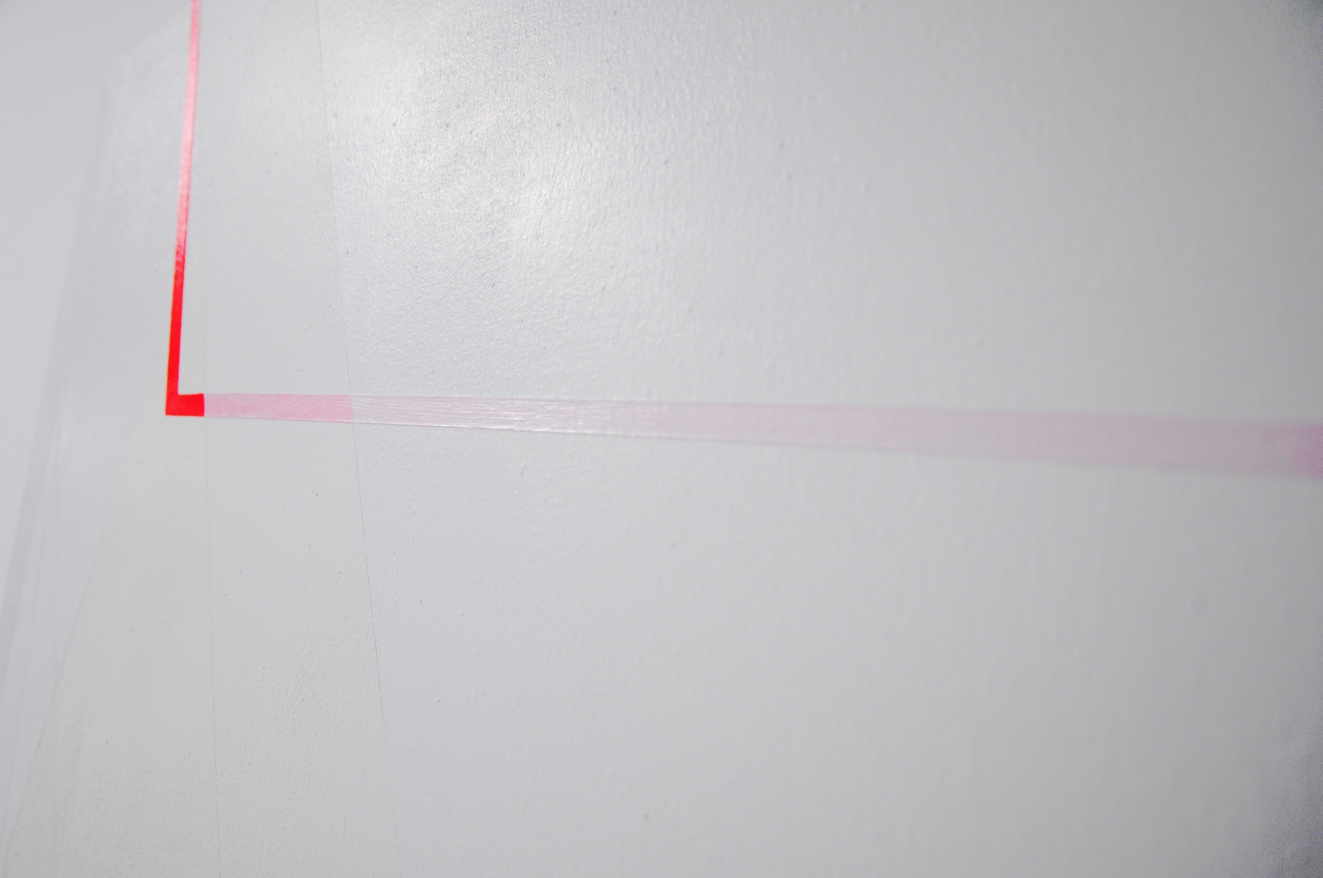


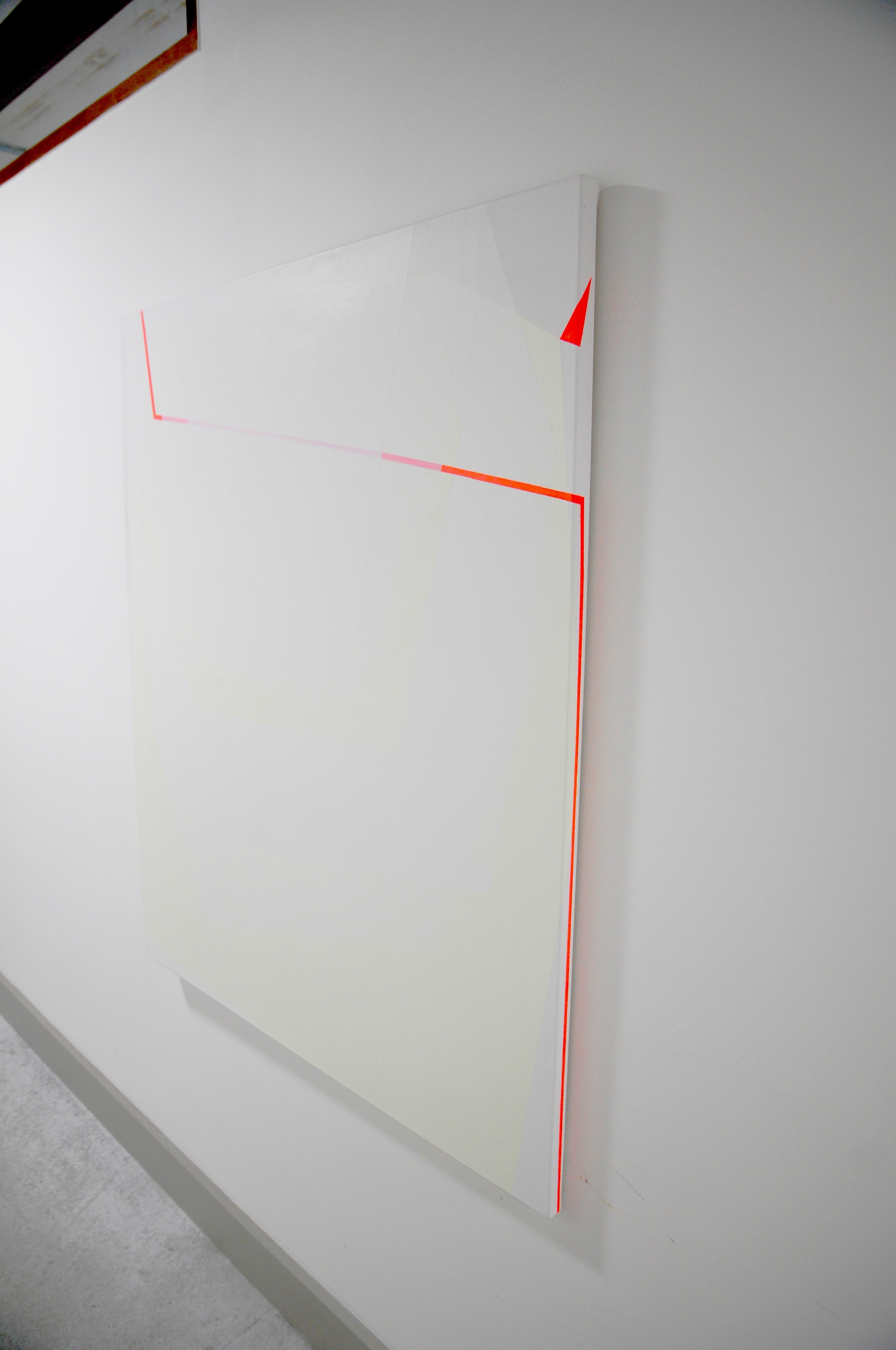
Untitled [Three dimensional box in ply] .
Amplifying the surface more extremely is an experiment I have been making. My deep frame canvases haven’t been deep enough to carry out the ideas I have been trying over the years and so this three dimensional box is the substantial iteration of that. From the smaller preceding ply studies there were planes of colour that were moving across. This is the next step on where the elements go around the sides and over the top – an element of wrapping the object as well as unfolding around it.
There is a stage on from this of exploring both ‘the material of the canvas’ and ‘the material of the paint’ as separate yet combined elements which constitute the painting.
All images © Trudie Moore


Supporting studies .
The studies below experiment with concepts in the pieces above, some are tests, some are works in their own right.


Alongside my fine art practice I undertake commissions and sell existing work. You can find out more here, or learn about the Artist Support Pledge.

Scaling up and expanding
Sometimes working on multiple small paintings at once leads to results that require a little expansion - to further explore something to see how it might work if the areas and proportions changed.
I've always enjoyed large scale paintings, my work generally lends itself to a more ambitious scale rather than being confined into smaller dimensions, but smaller works do help to create a volume of ideas and exploration.
This is how a few of my recent big canvases started out. I scaled this smaller piece up to a really big painting as I could see the capacity it had that would lend itself to a bigger expanse.
The detail of the ‘balance’ (the linking of elements), the semi-opaque white as a leading element to this piece, are favourite points for me.
I had to scale the piece from rectangular portrait dimensions to square and devise how the colours would work on a white primed canvas when the background wasn’t a neutral base of ply.
With painting onto the white primer there’s a need to cover the whole surface, unlike with the ply, which means all of the painted shapes become more as one, rather than benefiting from the natural way the ply becomes visually, and tangibly another plane.
With the ply it’s more obvious that the surface is separate and the paint sits on top of it. With a canvas this is less so the case. And then there’s an element of illusion in the two dimensional effect as well where just by adding a painted colour, it changes the planes.
Yellow and white abstract.
This painting is another large scale translation onto square canvas from one of the smaller studies on ply that I did.
The asymmetric composition and diagonal lines with linked elements are where I feel the flow with this, as well as the introduction on this larger piece of the red triangle ? contrasting with the subtle green and white, yet linking across to the fluorescent yellow.
As with the other large painting that evolved this way, there were changed and adaptations I made to transfer to a white background (primes canvas) and the larger, square format.
Now having lived with it for some while, and having progressed other pieces I’m eager to add something, another element, that was never a part of the plan when I started.
So you could say that this piece has taken almost 2 years to do!

I once had a conversation about how I develop my paintings, do I plan them? The suggestion was that I could plot them up on on a computer before painting.
But despite the time to learn a way that suits me for this to work, I struggle with that as my brain works better by using the paint itself. And actually a lot of the time what I plan changes as I’m doing the painting.
I can lose the impact if I try to plan too much. Perhaps you could say it was a 2-way conversation with the painting where it starts to guide you. You could say this was an intuitive approach but I think it’s more of a collaborative process with each piece.
Or maybe I prefer to just enjoy the moment or the instant that something reveals itself to me. A bit like running. I hate to run out and back on the same path, the run back is too difficult or painful to endure, I like the constant change of the new all the time. To plan a painting and then paint it, I think kills the joy and the thrill/ tension in the moment of actually getting the idea direct to the painting.
But I do use a sketchbook so that I don’t lose ideas and thoughts when they hit me or when I want to work out how something is going to work.
And so with the development of paintings, I love nothing more than to work on several at once. If my mind goes off on a tangent with an idea I can do it on another painting instead of being solely tied into the one and then losing the idea by the time I’m done. And I can develop nuances I think of once I’ve started by running those thoughts and ideas across a group of paintings at once.
That’s what’s happening in this picture, several pieces in development at once feeding into one another, a neon hotbed of ideas!